|
|
|
I needed some Code 39 bar code fonts. However, most barcode fonts that
are free or claim to be public domain still have copyright lines in the
font! And most of them have their font rights set to prohibit
embedding. I either had to spend real money, become a font pirate, or
create my own. So I created my own fonts! To help everyone else, I've
declared all my creations Public Domain, made sure the copyright line
in the font also says Public Domain, and cleared all the font rights.
Just click the barcode image (above right) to get all the fonts you see
on this page!
Code 39 BarCode Basics: Normal
Code 39 characters are 0 through 9, A through Z (uppercase), and the
punctuation characters period, dollar, space,
slash, plus, and minus. Code 39 fonts
require
an asterisk to be the first and last character (The asterisk doesn't
appear in the scanner output because it only acts as a start/stop
marker). For most Code39 fonts, if you need a space
in the bar code output, use an underscore as the source character. 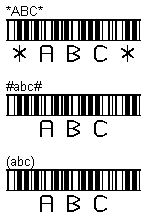 My Code 39 BarCode Extensions: All the barcode fonts here create uppercase barcode outputs from upper or
lower
case letter inputs. These fonts also allow you to use
any undefined character instead of an asterisk for the start/stop
character. A proper asterisk bar code will be generated, but
using a non-standard start/stop character will suppress the plain-text
display of the asterisk (for those fonts that display text). For
example, notice all the bar codes to the left have identical bars, but
show or hide the start/stop asterisk based on whether or not an
asterisk was actually used. Some people don't like to see the asterisks
because they consider them confusing. This gives everybody a way to
hide or show the asterisk as they wish. My Code 39 BarCode Extensions: All the barcode fonts here create uppercase barcode outputs from upper or
lower
case letter inputs. These fonts also allow you to use
any undefined character instead of an asterisk for the start/stop
character. A proper asterisk bar code will be generated, but
using a non-standard start/stop character will suppress the plain-text
display of the asterisk (for those fonts that display text). For
example, notice all the bar codes to the left have identical bars, but
show or hide the start/stop asterisk based on whether or not an
asterisk was actually used. Some people don't like to see the asterisks
because they consider them confusing. This gives everybody a way to
hide or show the asterisk as they wish.Font Embedding: You can "embed" all these barcode fonts in a Word document so that anybody who views the document will automatically get the font installed on their computer. Talk about a no-brainer installation method! For font embedding in Word, select "Tools"/"Options" and go to the "Save" tab. Check the option to embed fonts. You don't hear about this too often because most font creators forget to set the font rights to allow it. Or they intentionally prohibit it because they are, after all, in the business of selling fonts, not giving them away. Unlike me! You can also embed these fonts in email and web pages using the WEFT tool from www.microsoft.com/typography, but it's not worth the effort in my opinion. Microsoft Office Problems: I discovered that Microsoft Word (but not WordPad) has a nasty habit of adding an invisible space at the end of every line. When you use Code39, it suddenly becomes visible and ruins your bar code! As a result, most Code39 fonts (including mine) require you to use an underscore instead of a space. That way the font can ignore those "invisible" Microsoft spaces. I discovered that most Microsoft Office products (Word and Excel, but not WordPad) have a cool feature buried in the auto-correct part of their options that will "auto-format as you type". If you put asterisks around something, it will remove the asterisks and convert the surrounded text to bold. Which is a real bummer in Code39, because it usually requires asterisks (except for my font, which allows other characters) to surround everything. So you probably want to disable that feature! Because my fonts allow you to use parentheses or hash marks or other characters instead of asterisks, you can work around the asterisk problem. If you put underscore characters around something, the auto-format feature removes the underscores and changes the surrounded text style to underlined. Which again is a bummer, because most Code39 fonts require you to use underscores where you want a space. You'll only notice it if you have two or more underscore characters in your bar code. Again, this is a "feature" you probably want to disable. Finally, it isn't a real problem, but it causes a real scare! If you select a smaller font size than your current document zoom can use to display the barcode, the on-screen display of your data will change to a regular (non-barcode) font. It looks like the font broke, but it's just Office making a judgement call on how to render what can't be rendered. If you change your zoom settings, you'll see your barcode fonts are just fine! |
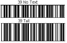 Standard Barcodes Standard Barcodes To start, here are the standard "naked" bar codes. Notice these fonts (like all fonts on this page) have a distinctive top and bottom border. The top and bottom borders don't interfere with scanning at all. As viewed here, these fonts (and all the fonts on this page) are at about 26-point type. On most scan guns (and with a good laser printer), you can expect good results down to at least 10-point type. At least! The width per character in these bar code fonts is only about 20 percent wider than Courier New. That's pretty narrow at the smaller font sizes! |
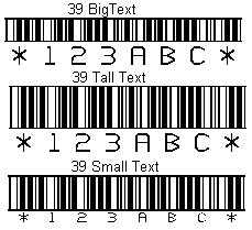 Barcodes With Text Barcodes With TextHere are the "ordinary" bar code fonts that have text below them. The "39 Small Text" is one you'll need a magnifying glass (or the eyes of a teenager) to read if you try printing it at 10-point type! But it looks great at 26-point, doesn't it? The others read fairly easily at 10-point. At 10-point, the "39 Big Text" bar code area is less than a quarter-inch bar code height (the spec), but it scans just fine. Besides, it's a great compromise between easily-read text and minimum vertical height if space is at a premium. |
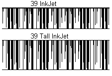 InkJet Fonts InkJet FontsI'll bet these funny-looking things got your attention! Yes, they are Code 39. These fonts have "Ink Jet" as part of their name because they solve a common problem. How can you print bar codes on a cheap ink-jet printer? Or on an old laser printer? When you try to print a small bar code, the ink "spreads" (either immediately on an inkjet or over time on a laser), which ruins the bar code. These fonts use a variable-width line. The lines start out normal at the top, then narrow as they go down. In spite of what you see here, it does NOT fade away to nothing! Printers have better resolution than computer screens, and the printer will see the lines continue all the way to the bottom. Somewhere in that range from top to bottom, the variable line spacing will cancel out the amount of ink spread your printer has. Which means at worst, you'll always have a "sweet spot" that will scan. In real life (on real paper and small font sizes), the entire barcode scans, and the lines don't look narrower at the bottom; they just look like they use less ink. Really! |
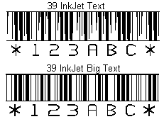 InkJet Fonts With Text InkJet Fonts With TextHere are the "Ink Jet" fonts with text below them. The "39 InkJet Text" uses the same variable line width described above. I have to tell you, it's worth it to use a font like this just to see how many people think your printer is running out of ink. The "39 InkJet Big Text" may look normal, but if you compare it to the truly normal fonts near the top of this page, you'll notice this font has a lot more white space! All the lines in this font have had their width reduced by the same absolute amount. Unlike the variable width line approach (which gives you scanning success somewhere between the top and bottom), this "best guess" line width allows you to print one or two font sizes smaller than you could with a normal barcode font. This is a fantastic compromise font when you are printing small sizes! Even laser printers spread the line width at 10-point font sizes and below. The narrower lines here do a good job of compensating for most printers and most smaller font sizes. |
Highly Recommended
http://www.microsoft.com/typography/
If you do anything at all with fonts, you'll want this. It gives you
lots of information when you right-click a font to look at the
properties.
Lost? Look at the site map.
Bad links? Questions? Send me mail.